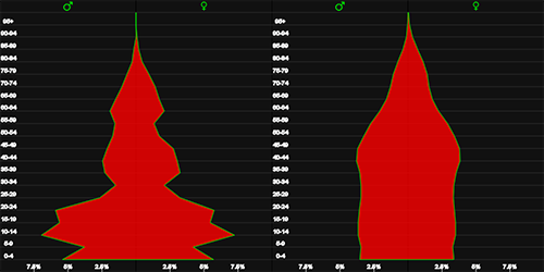
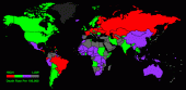
WORLD LIFE TABLE
The many longevity patterns that exist in the world today make it difficult to observe how life expectancy in your country compares to other countries at different ages and genders. We invented this World Life Table to help you understand these variables so you can see how differently we age depending upon where we live. Creating an environment that allows you to view the World as the sum of its parts required us to divide countries into Regions, so you can build "Your World" in stages and observe these interesting patterns at your own pace and in your own sequence. By proceeding in this way you can see how dramatically life expectancy rankings can change depending upon the age and gender you choose. We used Asia and Europe as the default Regions. If you want to begin with a different Region simply click on the button selected and it will be removed.
One of the benefits of following this procedure is it allows you to see how countries rank within their own Region before you compare them to the rest of the World. Choose different combinations of two Regions if you are in the mood to create a competitive environment...but don't forget to use the drop downs to change age and gender because the "winner" will often be quite different depending upon which variables you choose. You can also add all the Regions and then remove certain ones to see the world through another lens. We think you'll find the intellectual exercise of "filling in the blanks" useful and very informative.
- Click on any region to begin
- Remove a region by clicking the button again
- Use the drop downs to select age and gender
- Use clear button to start over
- HIGH
- LOW